Qlik has rolled out the September releases of their products. Check out the highlights for Qlik Sense below.
Augmented Intelligence Enhancements to Insight Advisor Chat
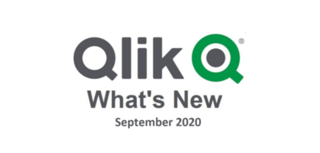
This new release of Qlik Sense offers users several enhancements to the Insight Advisor Chat. The multilingual Natural Language Processing interprets the user’s dictation and now delivers additional insights via Natural Language Generation. For example, automatically generated diagrams, narrative insights, observations and more; all providing for a fully conversational, natural language-based experience.
The September version includes enhancements to the analytics calculations in the associative Qlik engine. At the snap of your fingers, Insight Advisor will now auto-generate several new types of visualizations. These include:
Cluster Chart – Displays clusters using the new k-means clustering function. Allows one to group data points based on similarity to clusters. This can be used for customer or product segmentation.
Correlation Chart – Shows correlations of a linear relationship between variables using the correlation function.
Control Chart – Demonstrates how a process changes over time. Define events over time, upper and lower control limits, highlight outliers or trends and more.
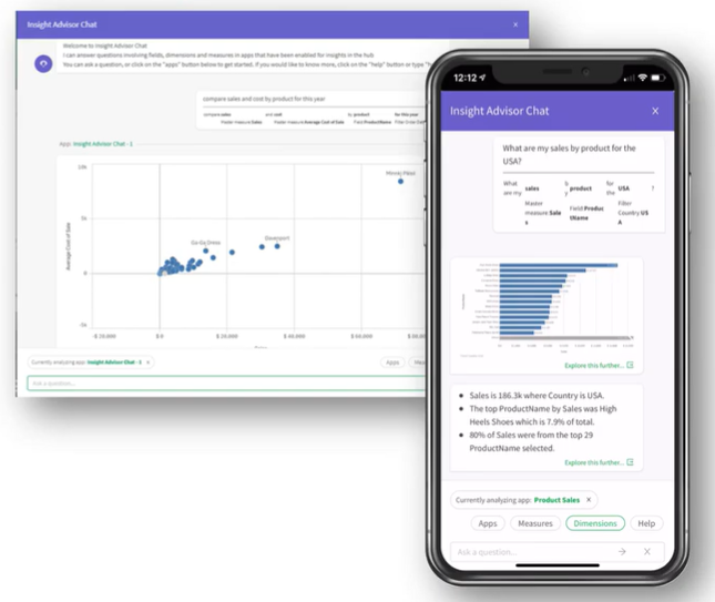
Added business logic now allows the behavior of the Insight Advisor to adapt and be controlled during insight generation and user interaction using rules and metadata. For example, fields can be logically grouped, data classified, and preferred relationships can be defined. Users can create calendar periods to define how measures can be aggregated and compared based on preferred time frames.
Visual Analytics Improvements
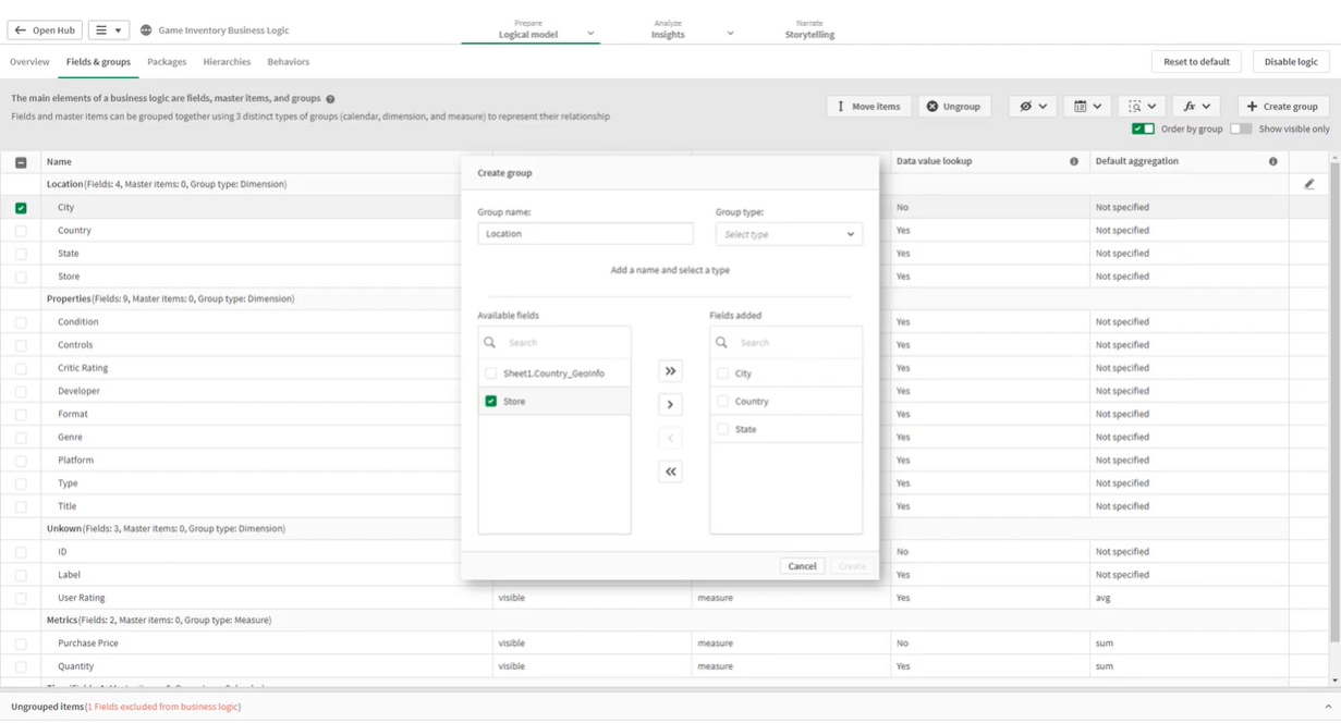
Improved Reference Lines
Bar and line charts are now equipped with dimension-based vertical reference lines with formatted labels. These can be used to provide charts along a time axis with additional information.
Animator Control
With the new Animator Control, data that changes over time can be animated with the click of a button. In this way, values in each dimension are automatically selected and played in a loop.
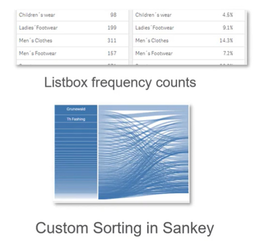
Custom sorting in Sankey Chart
Frequency counts in Filter Pane
Other Improvements
Search-based Visual Analysis on Mobile Devices
Increased SaaS Capacity: In-memory apps size limitations has been doubled to 5GB, and the limits for reloads and total memory have been removed.
Increased API Support to include Enigma.js and Nebula.js
Qlik Alerting: Ability to view alert history in the inbox.
Data Literacy built into the UI: This includes more context for chart creation and additional explanation for dimensions/measures.
For more information about this release or about Qlik in general, please contact a Pomerol Consultant today!
More Insights
-
Qlik to Power BI Migration

-
Client Product Reporting in FX Sales & Trading

-
Consolidating Financials for Multiple Acquisitions

-
How Machine Learning Can Transform the Financial Sector in 2024

-
Tracking Key Business Metrics using Power BI

-
Update on the future of Talend Open Studio

-
Multinational Bank’s Need of Fluid Understanding for their FX Pricing

-
Building a Single View of a Customer’s Portfolio to Support Regulatory Compliance

-
Exploring Change Data Capture (CDC)

-
🔍 Excel vs. BI Tools: Why It's Time to Evolve Your Data Strategy