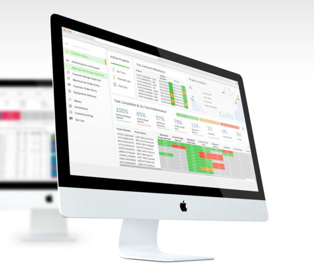
The first release of Qlik Sense for 2019 has just landed and, as always, there’s some awesome new functionality worth discovering.
These quarterly releases can make it hard to keep up, so we’ll continue summarizing the best bits in a blog post following each new release. For those that are lagging a few releases behind, check out our prior blog posts to discover what Qlik’s been working on…….you might be surprised at what you’re missing out on!
Qlik Sense is now sporting many much loved and sorely missed features from QlikView. There’s also a heavy focus on improving the experience for business and self-service users, and some great features to further enable rapid front end report development.
#1 The Visualization Bundle
Adding to the great package of dashboard extensions that shipped with the Nov ’18 release, we have a new ‘Visualization Bundle’ to explore. These greatly anticipated chart types offer you an even wider range of visual objects to help tell your data story. There’s 7 in total, but my top 4 are:
○ Funnel Chart: Great for visualizing stages of a linear process – think sales pipeline stages, website conversion levels or a recruitment process.
○ Heat Map that can display a measure with varying color densities over 2 dimensions. Eg. Car crashes by day of week and week of year – is there a time in the week when crashes rise or a seasonal impact on incident levels?
○ Network Chart to present a cluster diagram highlighting the relationship between different nodes – great for visualizing an IT network or goods distribution network.
○ Sankey Chart: A great visual way to show the transfer, flow or level of relationship between different dimension values.
This bundle of great visualization extensions is an optional package and you can choose to include it by ticking a box during the software install. If someone in I.T is running the software update be sure to mention to them that you want both these extension bundles included. There’s also a great companion video. on the Qlik YouTube channel showing you how to take advantage of these new chart types.
These Qlik supported extensions remove the need for many of the open source extensions people have been using. This removes the risk of open source code and enables a lot more creativity in dashboard design.
#2 Qlik’s Associative Big Data Index
This is awesome. You can now use the power of the associative engine on top of ‘Big Data’ repositories, without moving the source data. Indexing takes place in the Data Lake, and you can analyze what data you have available without the need to transfer it to an intermediary repository.
This is extremely useful when interrogating a data source with hundreds of millions, or even billions of rows. Analyze the data where it resides, in Hadoop for example, work out what is relevant/important, and then build your data extraction queries with this knowledge in mind.
#3 Variable and Dollar Expansion Evaluation
Ok, so this one’s a bit nerdy but is an incredibly helpful addition to the expression editor window. When you use what Qlik calls ‘dollar expansion’ in variables or expressions, Qlik will now evaluate the ‘dollar expansion’ on the spot and show you the value.
For example: If the expression was Sum({$<[Order Date]={‘$(=today())’}>}Sales) you would normally need to go and evaluate separately that the variable $(=today()) was resolving to the correct date. You can now see this variable evaluated at the bottom of the expression editor window. This lets you check on the spot that your syntax is correct and gives you a neat way to validate the variable prior to committing to changes.
This is a great new tool for developers and business users alike. Developers have a quick way to validate variables, and business users, that might be less comfortable using set analysis, now have a quick way to validate their syntax.
#4 Enhancements to NPrinting
Qlik continue to improve the functionality of NPrinting with every release, and the Feb ’19 version is no exception. Here’s two particularly handy improvements:
○ Variables in Emails: This is a neat advancement allowing you to add variables within the email body or subject line and send dynamic content to your recipients. Great for highlighting a few core KPIs in the body with the detail as an attachment.
○ Edit Image Dimensions: Qlik will now let you edit the dimensions of an image exported to an NPrinting report. This is a big help in improving the user’s ability to customize their NPrinting reports. You can do this in PowerPoint, Excel or Word, and set the image size by pixels or use one of the stretch options.
What Else?
So, there’s the latest and greatest, plenty to get up to speed on and plenty more to look forward to in the next release in mid-2019. For a great overview of the latest release check out Mike Tarallo’s great video here.
For tips on how to get the most value from the latest functionality releases, or for assistance in upgrading your Qlik Sense software versions, get in touch with Pomerol Partners.
Like the article? Like and share it on LinkedIn!
More Insights
-
Qlik to Power BI Migration

-
Client Product Reporting in FX Sales & Trading

-
Consolidating Financials for Multiple Acquisitions

-
How Machine Learning Can Transform the Financial Sector in 2024

-
Tracking Key Business Metrics using Power BI

-
Update on the future of Talend Open Studio

-
Multinational Bank’s Need of Fluid Understanding for their FX Pricing

-
Building a Single View of a Customer’s Portfolio to Support Regulatory Compliance

-
Exploring Change Data Capture (CDC)

-
🔍 Excel vs. BI Tools: Why It's Time to Evolve Your Data Strategy

