Creating Analytical Applications with Qlik – a Fin Services Use Case
Over the past few months we have written a few blog posts describing various hidden tips and tricks relating to the Qlikview platform. We have made mention of topics such as the magnificent “dual calendar” – which takes us further from standard reporting and a step closer to analytics. What is the difference between Business Intelligence and Business Analytics ? BI is needed to run the business while Business Analytics are needed to change the business.
It is now time to discuss analytics in detail and provide some examples. This particular blog post will discuss a recent example of an analytical application which resulted in lots of praise and immediate, direct business decisions being made by the client. The screenshots here relate to a simplified, replica tool and the data is fictious (as well as the exact use case and client). Other analytical use cases will be described in subsequent posts (next is our blog on identifying growth vs defensive clients).
The example environment is Corporate FX Sales and Trading. The problem statement is that price plans are applied to a client, often upon take-up and then after that the business losses traction between price plans and actual client activity. There is no easy way to analyse clients against price plans so it tends to get less priority that is needed. However, during tight economic times the business case to grow revenue from existing clients as new logs are getting harder to land. This might seem like a small problem but if you are a global FX player with more than 5,000 clients then this becomes very important – increasing revenue on a fraction of 5000 clients can be significant to a P&L.
After discussing the problem statement with the client, we managed to persuade them that this can be solved via Qlikview and there needn’t be a dedicated, bespoke pricing analysis system (yes, the first impulse is often to build and maintain yet another system for millions of dollars !). The implementation time was estimated to be roughly 4 weeks of a single developers time however we added in a contingency time as there were typically some unknowns with regards to business logic in a number of their legacy pricing systems. With unknown business logic, it is often left up to our development team to discover this and then try reengineer the logic with the client (Pomerol generally works with business units instead of working directly for IT teams).
Our build approach was based around two steps. Step one gave the client the ability to bucket groups of clients according to different selections and trading volumes. This is important, as the sales team needed to quickly slice and dice their clients according to different scenarios before looking at pricing opportunity cost. Lets have a look at this functionality a little further.
The above is the default screen. In this scenario, the sales team have selected the current year to date and before they navigate any further they enabled the prior year with the same month range. This is so that they can identify relatively stable clients. In this exercise, opportunity cost calculations (and hence re-pricing) need to be done from a stable trade activity.
Note how this app is only looking at clients based in Australia as the Sydney desk has been selected. A few simple clicks can widen the scope but, in this example, we will leave the APAC region only. Of course, client hierarchies in large investment banks are highly complex. So, we could have built this application based on Parent Country, or actual client country instead. However, we have selected the trading desk which is where the trade was originated from (and hence where the pricing occurs in this instance).
Next, the team only wants to look at pricing for clients that have traded Euros. As they have a new focus on the Euro activity (they have a few new trading desks in Europe) and due to this the team marketed the rapid settlement of Euros to their 5000 corporate clients, hence it is time to look at pricing for all Euro activity only. With the ease of Qlikview search boxes, by simply placing “EUR” around the wildcards and pressing enter.
At this stage, we have done something impressive. We have selected a group of clients based on the stable trading activity between Q1 & Q2 or 2014 vs the comparative period for last year (all clients between a -10% and +10 change in their notional trade volumes). Already, this would have taken a lot longer in other tools and actually in this use case many hours of offline Excel pivots and “sumif” functionalities.
The result is displayed on the screen for the team to see. There are presently 1,312 clients that have come up with this selection criteria. Interestingly this comprises of roughly 250K trades.
Yet we haven’t actually grouped them yet. Grouping clients is important to this team as they think clients take their notional volumes and number of trades to rival banks for competitive pricing. By trying to group all the clients with a certain trading volume, the sales team can visit the wholesale department and try negotiate better internal rates.
See our upcoming blog post on identifying growth or defensive clients which also helps with internal pricing decisions. The case here is that the sales team only want to target “mid-tier” volume customers. They believe that these clients don’t acknowledge the value of their actual deal flow and generally only push hard on price negotiations for very large trades. An example of this would be a CFO demanding a great rate for a million dollar plus currency exchange but doesn’t really take note of the other 300 FX trades made during the year when it comes to pricing. This valuable intelligence comes from the sales team and they have now made a price plan to target these clients. This tool is not only about finding those clients but calculating to the revenue potential of switching them to the new price. Without this tool that would be the case, however now that we have such powerful functionality in our hands it boils down to calculating the opportunity cost of not switching them across.
The team decides to group the clients as follows:
Take all clients between 100 and 350 trades during the current calendar selection (6 months) and have an average trade notional between $15,000 and $57,800. With this selection, the sales desk is happy that they have a group of clients that are “busy” FX clients but are not the heavy hitters. The smaller volume clients have a volume too low to justify price changes as that involves contacting them, note that in this selection there are still 374 clients which is significant.
Likewise, heavy hitters need special analysis and perhaps need more particular pricing according to their regional flows and current pair mix that they deal in. The sales team could also omit clients from the mining side of the business as they are ringfenced with a separate client service team (the pricing is discounted as part of a wholesale banking package).
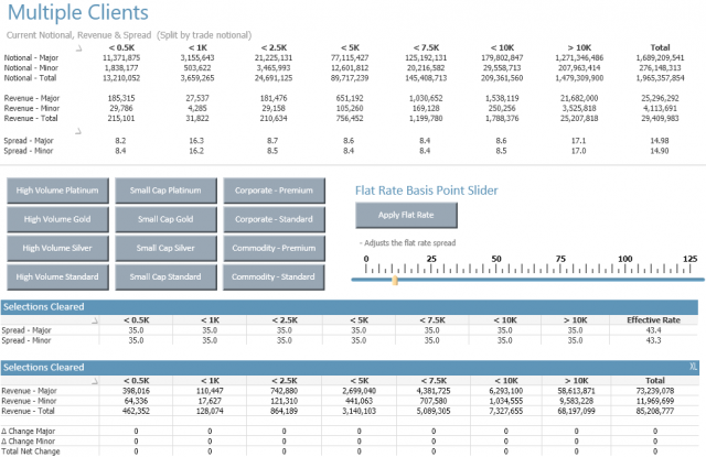
There we have it, 374 clients that is in the current selected period generated circa $29m in trade revenue off the back of 200,000 trades. Now its time to move to the price planning tool and compare the various price plans in the system. By selecting an analysis button, the following screen appears:
The screen might look a little complicated, however it is straight forward analytics. The top part of the screen has the current revenue for the client activity and the sales team have the ability to select different price plans to see the resulting revenue and revenue change in the bottom half of the screen.
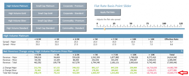
For example, if “High Value Platinum” is selected then we can immediately see that using the current set of historical trades there will be a net opportunity cost of $15m to the business. Let’s take a closer look at this. This price plan is revenue generating for lower notional buckets, however there is a significant opportunity cost on the trades with a higher notional value. It seems as if this price plan is heavily discounting high notional value trades but, in this case, it is to the detriment of the bank.
The team goes through various pricing plan options to see the net opportunity cost, including the slider to see if a flat rate of 3 basis points can be applied across all notional buckets (see below)
In this case the opportunity cost is slightly lower at $4m. Clearly that price plan wont work, however it seems as if the “High Value Gold” price plan really yields positive results. There is a net gain of $8m dollars which is split between majors and minors by $6m and $2 respectively.
The sales team have found a price plan which seems to fit the selected client grouping. By looking at the spreads under the different notional buckets they can asses where the real gains are made. This might then lead them to create a dedicated price plan, or with the tool there is opportunity to test all the other price plans and determine if a new hybrid could be made. For example, taking the best notional spreads for each bucket by going through all of the price plans.
The list displayed in the original screen can now be printed out and the relevant changes can be made.
As previously stated, the above scenario is purely hypothetical, and the data is totally fictitious. However, the aim has been to demonstrate how using variables, buttons, sliders and a well-designed data model can lead to a dashboard that goes far beyond standard reporting. This is relatively easy achieved with Qlikview 12 – there is no requirement for custom extension development. This functionality is still possible to replicate with Tableau, MS Power BI or any other Business Intelligence Reporting Tool.
Want to find out more?
More Insights
-
Qlik to Power BI Migration

-
Client Product Reporting in FX Sales & Trading

-
Consolidating Financials for Multiple Acquisitions

-
How Machine Learning Can Transform the Financial Sector in 2024

-
Tracking Key Business Metrics using Power BI

-
Update on the future of Talend Open Studio

-
Multinational Bank’s Need of Fluid Understanding for their FX Pricing

-
Building a Single View of a Customer’s Portfolio to Support Regulatory Compliance

-
Exploring Change Data Capture (CDC)

-
🔍 Excel vs. BI Tools: Why It's Time to Evolve Your Data Strategy