
Make Your Data Talk
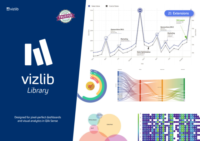
VizLib is an industry leading developer of Qlik Sense visualization extensions. Found in 2016 and not long after, the company earned a reputation for being easy-to-use, highly customizable, and thoroughly supported. VizLib’s goal is to help you tell a story with your data.
Vizlib’s Library and plethora of extensions for Qlik Sense add depth and versatility to development options. From styling and format specifications to new chart options and allowing one to perform advanced analytics, Vizlib offers an unprecedented way to create visual, media rich visualizations within Qlik Sense. All upgrades, bug fixes, and support request are provided free of charge. So if Qlik releases a new version of Sense, Vizlib includes the complementary upgrade.
VizLib is a valued partner to many of the world’s leading businesses that seek fast, effective and branded solutions to boost data adoption across their organisation. “Once you experience Vizlib, there’s no going back” (VizLib).
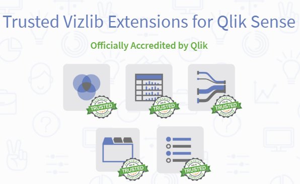
Vizlib is officially supported by Qlik.
The Vizlib Library bundle is by far the most powerful dashboarding solution for Qlik Sense. The incredibly intuitive user experience that requires zero coding saves dashboard builders countless development hours and opens doors to game-changing customization opportunities.
The bundle includes;
 Basic Charts
 Advanced Charts
 Components
With rich styling and formatting options, they can seamlessly blend in with your dashboard’s unique design. And support for Vizlib Actions, configurable tool tips and the Vizlib Wizard makes these nifty charts indispensable to your apps.
Slider, Advanced Text Object, Calendar, Filter, Line Object
![]() Navigational Elements
Navigational Elements
The Vizlib Sheet Menu allows you to create web app-styled Qlik Sense dashboards within Qlik Sense, completely removing the need for complex mashup development. While the Vizlib Container Grid, supporting a selection of presets and a responsive grid mode, greatly accelerates your build time and improves the functionality of your dashboards.
Sheet Menu, Container Grid
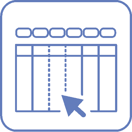
 Tables
Our famous straight and pivot table extensions give you the power to arrange and visualize your data in a way that’s easy to read, analyse and act upon. With added capabilities, such as HTML tool tips, dynamic column resizing, indicators, rich formatting and many more, you are in for a timeless love affair with tables.
Straight Table, Pivot Table
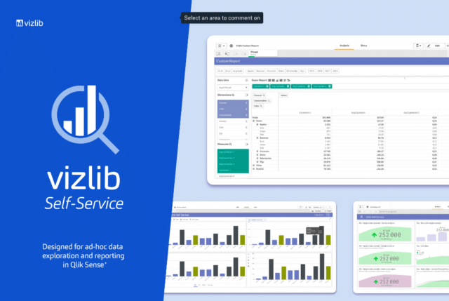
The Vizlib Self-Service bundle is the ultimate ad-hoc reporting solution for Qlik Sense. It charges your apps with advanced functionalities that make your data talk through interactive reports. It’s the best of self-service analytics, in one neat bundle.
The bundle includes;
Custom Reports
 – Create dynamic straight or pivot tables based on data in master tables. Select from professional presets and leverage rich customization.
Card Extensions
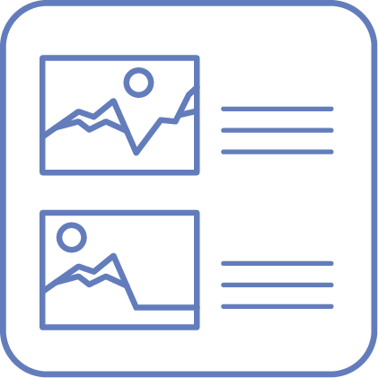 – Spruce up your dashboards with pictures of products, logos or even people.
Selection Bar
 – Customize this horizontal selection bar with pre-selected values that allows for fields, variables, and flags to be displayed.
KPI Extension
 – Create rich KPIs with configurable colors, actions, navigation and trends.
Container Box
 – Utilize custom template styling or design your own container box to save much need real estate within your apps.
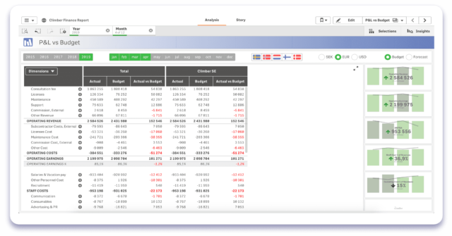
The Vizlib Finance Report bundle is built to meet the requirements of a modern finance department. With the advanced formatting and customization functionalities, you can make any financial report look amazing and just the way your CFO wants it!
The bundle includes;
 – Finance Report
Effortlessly build custom P&L tables or Balance Sheet reports that allow users to drill-down into their data and discover meaningful insights faster.
 – Real-time commentary capability
Take your financial reports to another level by adding real-time comments associated with your data. No more confusion or back-and-forth! The setup is completely secure and allows for multiple levels of reporting.
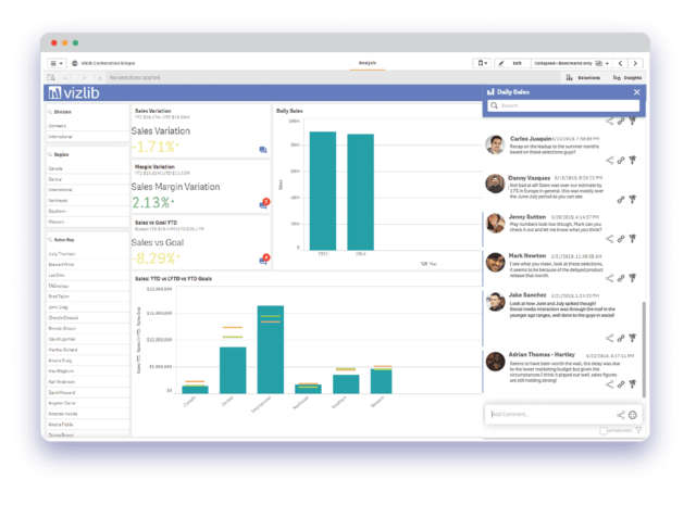
Vizlib Collaboration improves the process of communication around your data. It gives you an ability to share insights, discuss and argue around the data avoiding disconnections. See what happens to your decision-making process when you empower your team to handle data confidently and converse, collaborate and share knowledge directly in Qlik Sense.
-Sheet or Master Item level Commentary
-Tie your comments to bookmarks or selections
-Rich Commentary Editor
-Private or Public Notes
-Notifications via email or Slack
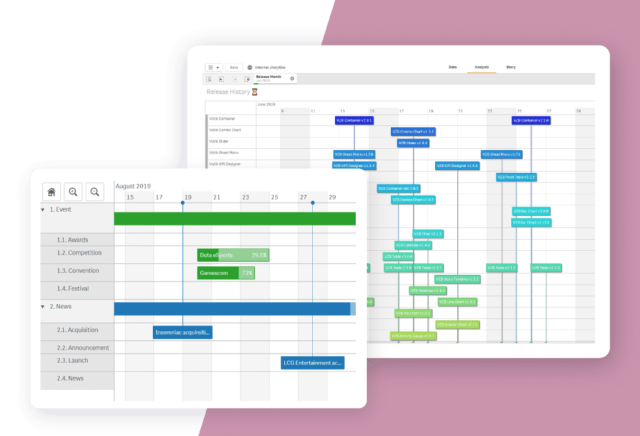
Vizlib Gantt is the most intuitive project planning timeline extension for Qlik Sense, giving you the superpowers you need to keep projects on track, stay within budget, optimize resources and forecast accurately. It’s jam-packed with powerful capabilities, such as HTML tool tips, dynamic markers and milestones, progress bar, rich customization, and more!
Vizlib Gantt is a powerful tool which illustrates the project schedule and helps the user to visualize the timelines and deadlines of tasks, upcoming events and activities as well as to understand the relationship and dependencies between them. Gantt displays whole projects in a single visualization by displaying various tasks and events on the horizontal bars, and time intervals on the vertical axis. It’s an excellent solution for managers of all industries.
-Project Planning
-Resource Planning
-Visualizing Process
Start your Pomerol Pilot today.
Now it’s showtime! We believe that we’re the best in class to do these things. This is going to be a real gamechanger for you. Connect with us today so that we can schedule a 30-minute call to take you through how we can help your business solve problems by finding solutions to increase your ROI. Be sure to designate in the notes that you are interested in learning more about Vizlib!